GTD App Review - Producteev
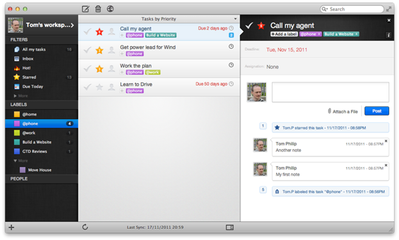
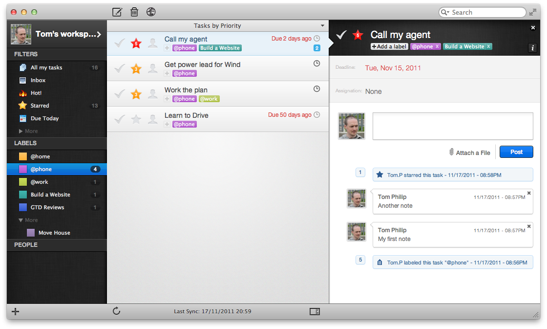
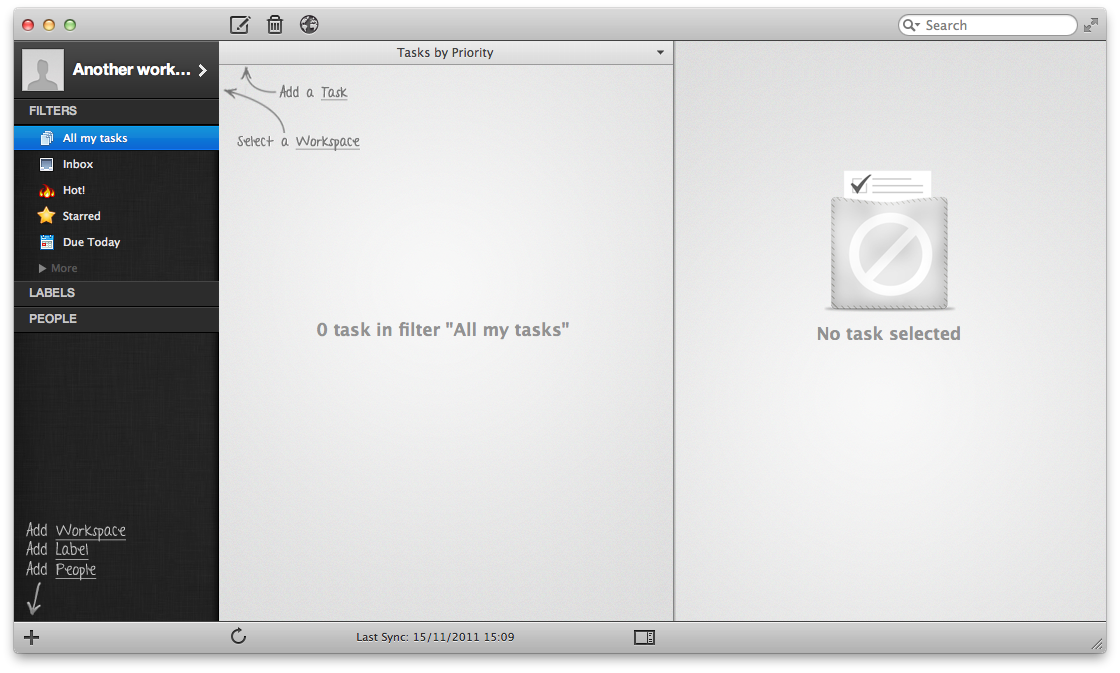
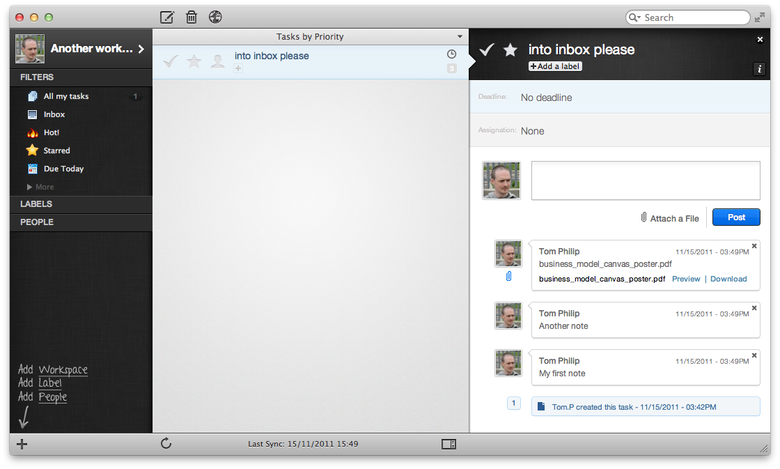
Producteev for Mac is a beautifully designed task list app, that’s a pure joy to use. You can’t help but feel that every little piece has been well thought out and designed. It uses contrast and colour to good effect, adding to its looks and helping the user to interact with and visualise tasks.
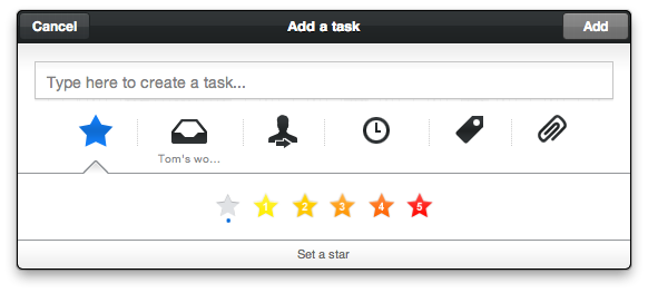
Adding new tasks is easy. Called up with a hotkey from within any app. It allows extra options (labelling, deadlines, starring etc) to be set too without it being an unwieldy dialog.
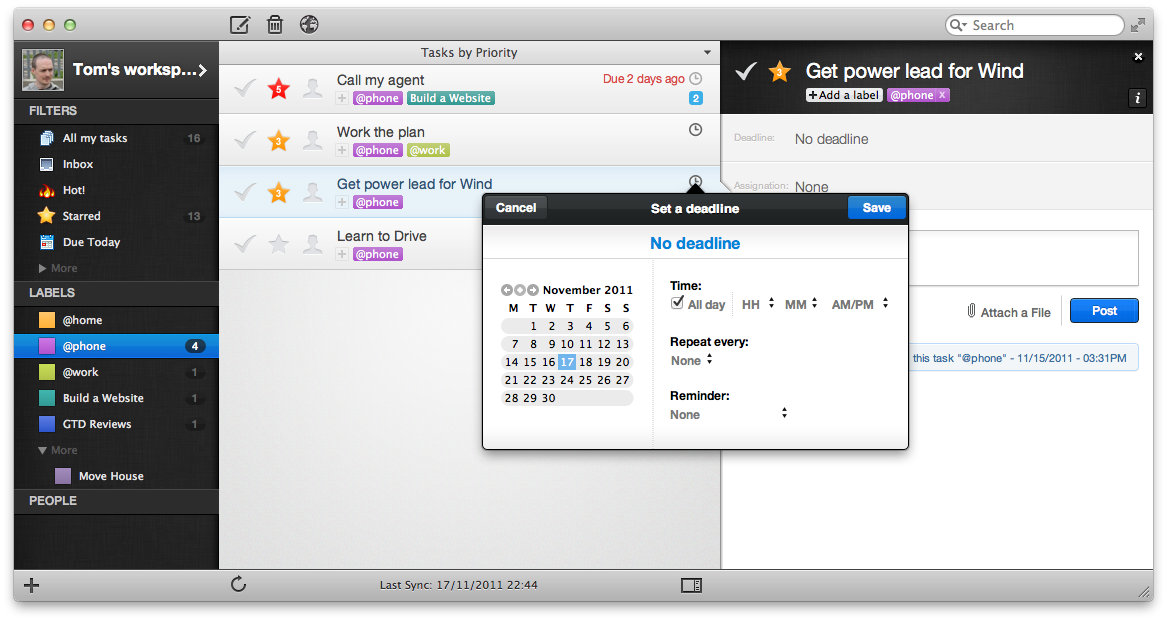
Task organisation is easy too, by clicking on the obvious icons to pop-up simple focused dialogs for each property of a task you wish to set (see Setting a Deadline screenshot).
Astrid would be the Android client in this trusted system but if their soon to be released Android app is anywhere as good as its Mac app, then I can’t wait to see that.
How it Scored
This is how it scored against the criteria for a great GTD app.
| Criteria | Result |
|---|---|
| Quick add | Yes. There’s an inbox but I think tasks that people asign to you land in here. |
| Projects/Sub-tasks | Yes, labels |
| Contexts/tags | No |
| Order tasks | No |
| Notes | Yes, multiple notes |
| Highlight/star | Yes, importance stars 1-5 |
| Search | Yes |
| Deadline | Yes |
| Reminder | Yes |
| Recurring tasks | Yes |
| Sync with Google Calendar | Yes |
| User Experience | 5/5 |
I put no for contexts/tags but you can assign multiple labels to task, so labels could be used for both projects and contexts. Not as nice as separate but a workaround. Another approach is to use Workspaces as projects and labels as contexts. The problem with this is labels belong to a workspace, so it wouldn’t be possible to see all tasks for a certain context. Also Google Calendar integration is per workspace, so for each workspace you’d get a separate calendar and need to connect this to Google. I’d be interested to here from anyone who’s using/tried either approach and the pros/cons of each.
Downsides
Labels not having the option to span Workspaces.
Having to manually connect each workspace to Google Calendar, thus creating a calendar in Google Calendar per workspace.
Puzzling
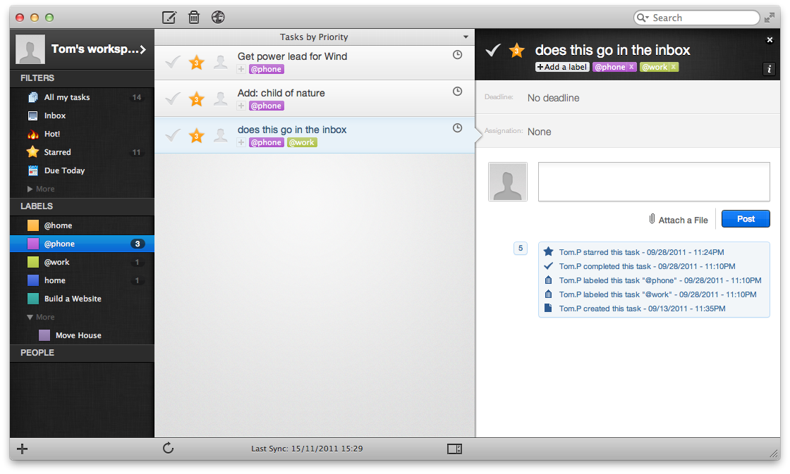
After 5 labels, you need to expand to see the rest of them (see ‘Moving House’ in the Main Screen screenshot). Shame it just doesn’t show them all or allow you to choose how many to show, there’s space.
Update 12/9/2012 - You can actually manually order the lists, by dragging and dropping them into the top half (above the more). So this puzzler goes away.
Dock badges just seem to be for tasks that you’ve assigned to others or have has assigned to you (I didn’t get to verify this with someone, so this is I’m assuming where dock badges come in). I was expecting to get badges for overdue tasks.
Useful Extras
- Import tasks from Remember the Milk.
- Multiple notes per task.
- Attach a file with each note. Multiple notes mean you can attach multiple files. 100mb file storage limit for free accounts.
- Workspaces for top level partitioning of tasks. Eg Work, Home etc.
- Enhanced for OSX Lion.
- Global hot key to bring up new task box.
- Audit trail. So you can see the history of what’s happened to a task.
- Assign tasks to other people.
- Collaborate on Workspaces.
- You can create your own filters using quite an extensive criteria and remove the default ones to.
- Smart task entry. Eg ** walk the dog tomorrow, adds a task with 2 stars and a deadline of tomorrow
- All items (labels and Filters) in the left menu can be dragged and dropped to re-order them.
How it Looks
Platforms
Web, iPhone, Mac and Windows (coming soon).
Support
They have a good support setup and are listening to customers, with a support site and feedback forum.
Price
Free for up to 2 users in any Workspace plus 100MB limit. Unlimited Workspaces. Then tiered pricing for more users, storage and others.

