The Best GTD App

When I started this review process back in September 2011, eager to find the perfect GTD app for myself. I was looking forward to whizzing through the reviews, to find a winning app that would meet my needs set out in the opening post . I was writing the reviews, at times, twice a week. Then babies, work and disillusionment set in. The latter came about as it slowly dawned on me that there wouldn’t be a clear winner, a perfect GTD for me (and others).
The conclusions I’m about to draw, as I choose my ‘perfect’ GTD system, will be a story of compromise. Will the app be, not perfect, but just good enough? Will missing features be made in the future? Many a “it would be perfect if …“.
Recap
The full story is in the opening post . To find the perfect app, I came up with some basic criteria the app had to meet in order to be considered, this got the list down from over a hundred to a manageable 9 (10 originally, until I realised Get It Done didn’t have a Mac app).
- Multi Device – Mac, Android and Windows
- Quick
- Available Off-line with Cloud Syncing
- Beautiful/Great User Experience (UX)
The following 9 shortlisted apps then got an in depth review:
… and now here we are, about to find out which I think is best and which will become my trusted system?
Comparison Chart
If you’re after a quick comparison, here’s how their features compared. The criteria is taken from my thoughts on what makes a great GTD app, outlined in the introduction post . I’ve included some ‘nice to have’ features that I discovered which I enjoyed and/or were useful.
| Feature | TODO | Due Today | Toodledo | Doit.im | Wunderlist |
|---|---|---|---|---|---|
| Quick add | Yes, into an inbox | Yes. Into an inbox if on home screen or into the list that you currently happen to be in. | Yes. But there’s no inbox | Yes. Into inbox or you can change when adding. | Yes. Into any list incl an Inbox. |
| Projects/Sub-tasks | Lists and sub tasks | Yes. Projects, Sub projects and sub tasks. | Yes. Folders and sub-tasks. Sub-tasks in Pro. | Yes, projects. | Yes. Lists. |
| Contexts/tags | Yes, both | Yes, both. | Yes, both. | Yes, both. | No |
| Order tasks | Yes. But order is not synced with Toodledo | No | No | No | Yes |
| Notes | Yes | Yes | Yes | Yes | Yes |
| Highlight/star | Yes | Yes. In paid version. | Yes | Yes. Starred tasks go into special ‘Today’ folder | Yes |
| Search | Yes | Yes. In paid version. | Yes | Yes | Yes |
| Deadline | Yes | Yes | Yes | Yes | Yes |
| Reminder | Yes | Yes | Yes | Yes | No (Yes – on Android) |
| Recurring tasks | Yes | Yes | Yes | Yes | No |
| Sync with Google Calendar | Yes. via Toodledo | Yes. via Toodledo. | Yes | Yes | No |
| User Experience | 3.5/5 | 4/5 | 0/5 | 4/5 | 5/5 |
| Notable extras | |||||
| GTD Specific | No | Yes | No | Yes | No |
| Hotkey | Yes | n/a | n/a | Yes | No |
| Badge | Yes | n/a | n/a | No | Yes |
| Import/Export | n/a | n/a | Yes | No | No |
| Widget | n/a | Yes | n/a | Yes | Yes |
| Attach files | No | No | Yes | No | No |
| Assign tasks | No | Yes | Yes | Yes | No |
| Price | £10.49 | Free/£1.85 | Free/$14.85 p/yr | Free | Free |
more…
| Feature | Astrid | Producteev | Nozbe | Conqu |
|---|---|---|---|---|
| Quick add | Yes. But it has no inbox | Yes. There’s an inbox but I think tasks that people assign to you land in here. | No | No |
| Projects/Sub-tasks | Yes, lists. | Yes, labels | Yes, projects. | Yes, projects |
| Contexts/tags | No | No | Context, with icons | Both context and tags |
| Order tasks | No | No | Yes | Yes |
| Notes | Yes | Yes, multiple notes | Yes, as multiple comments | Yes |
| Highlight/star | Yes. Importance stars 1-5 | Yes, importance stars 1-5 | Yes, for marking tasks as next action | Yes, 3 coloured flags |
| Search | Yes | Yes | Yes | Yes |
| Deadline | Yes | Yes | Yes | Yes |
| Reminder | Yes | Yes | No | Yes, scheduled date |
| Recurring tasks | Yes | Yes | Yes | No |
| Sync with Google Calendar | Kind of. You can add a calendar entry that is connected to the task | Yes | Yes | No |
| User Experience | 4/5 | 5/5 | 4/5 | 3/5 |
| Notable extras | ||||
| GTD Specific | No | No | Yes | Yes |
| Hotkey | n/a | Yes | No | No |
| Badge | n/a | No | Yes | Yes |
| Import/Export | Yes | No | Yes | Yes |
| Widget | Yes | Yes | No | No |
| Attach files | No | Yes | Yes | No |
| Assign tasks | Yes | Yes | No | Yes |
| Price | Free | Free | 9.95 eur p/mo | $53 p/yr |
Honourable mentions
These apps didn’t get reviewed because they lacked some feature/s that made them unsuitable. I liked how they looked and their features, they show great promise:
- Nirvana - Well thought out, great looking GTD web app.
- Assana - Good looking, collaborative task manager.
- Smarty Task - Great looking GTD app with some smart filters.
- Things & Omnifocus - Users of these had great things to say about them but sadly Mac only.
- Wunderkit - Wunderlists big brother, fantastic UI for collaborative task management.
- Any.DO - Slick Android app with intriguing gestures.
The Runners Up
It was really hard to choose my apps to make up my trusted system. There wasn’t a single one that looked like a clear winner. All of them had at least one thing wrong or missing. So it’s not that the runners up are bad apps, it’s just that the others were better, sometimes marginally.
Wunderlist
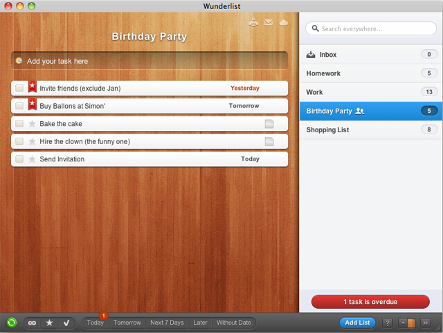
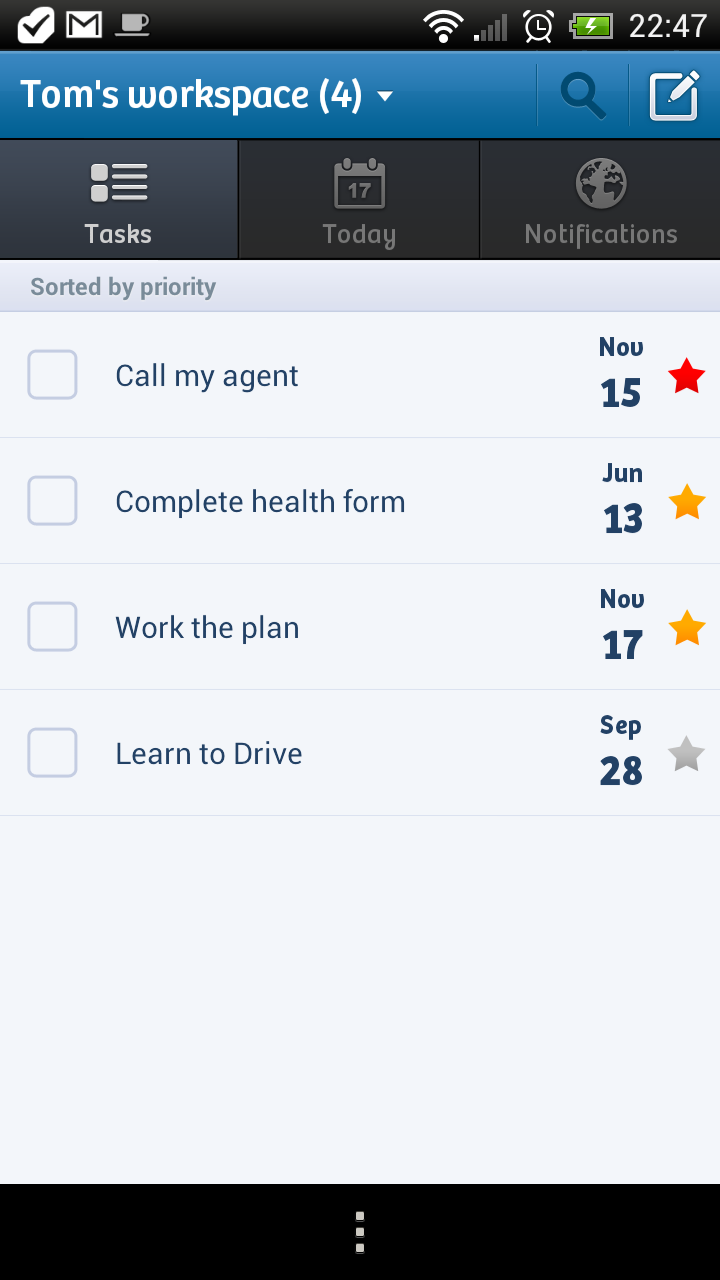
I love Wunderlists simplicity and looks but the lack of tags or appearing in more than one list, means no contexts. Based on that alone it loses out. Although there might be reprieve for this, as I’ve been using it for a while for my work tasks for Life Tuned and Pik Pak, in a kind of personal Kanban. With its drag ‘n’ drop task ordering (something surprisingly missing on most), it makes easy just-in-time ordering of the next tasks to do in a project, so it might remain as part of the system.
This is for you, if you after an app that has great looks, fantastic simple UX, same experience across multiple platforms and are happy with basic task organisation.
Conqu
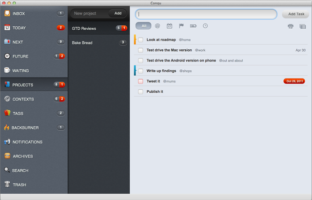
The odd UI and it’s clunky-ness is just something that would grate on me after a time , it bewildered me in the short time I used it. Plus missing features, like task recurrences (essential for doing stuff like monthly accounts) and Google calendar sync puts this one out of the running.
This is for you, if you after an app that looks good, supports many platforms (Playbook and Nook included), don’t mind Adobe Air and are not too bothered that it doesn’t look/work like anything you’ve used before.
Nozbe
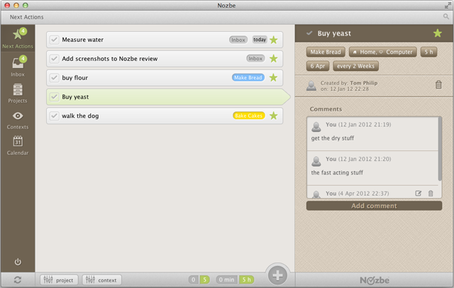
For the high price it has to be the best and I don’t think it is (yet). The brownish UI for Mac just doesn’t work, I can’t quite put my finger on it, is it because the colour palette looks like something off a toddlers app? I’m not sure. My biggest turn-off was their New Android app. With a small number of tasks it was slow. What would it be like with many more? It also looks like I’m not the only one having problems, it gets a right panning in the reviews on the Google Play store which worries me more. To be fair they’ve only just released their new Mac and Android apps, so perhaps one to keep an eye on for the future.
This is for you, if you after an app that is GTD all over, simple to understand, you use Dropbox and/or Evernote, your patient (as they get out of beta quality), rich and your favourite colour is brown.
TODO for Mac, Due Today & Toodledoo
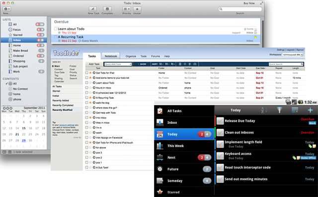
These apps come in as a threesome, working together to provide one trusted system. TODO for my Mac, Due Today for my Android phone and Toodledo for access anywhere (it’s Web) and providing the core service/glue that the other 2 sync with. One of the advantages of Toodledo is the many of 3rd party apps, so if I find that I don’t like Due Today, I can swap it out for one of the other many apps that sync with Toodledo. One particular app that caught my eye was 2Do .
Some people love Toodledo but I can’t get over its poor user experience. I don’t come away feeling happy, I just feel frustrated. It’s not alone, TODO for Macs task editing is jarring and the overall experience is mundane. They’re great at being functional, they just don’t delight. Due Today has it’s own foibles, chipping in with Floating Tasks!?
The other main problem, was the inconsistent experience. Not a fault of any individual app but nevertheless a problem as a whole. Take projects for example; TODO calls them lists, Due Today calls them projects and Toodledo calls them folders. They also have different special lists. Due Today has one called Future, TODO has one called Focus. The split boxes work differently too, TODO shows in gray the total number of tasks and in red the number that are overdue. Whereas Due Today shows in grey the number of tasks not overdue and in red those that are overdue. So for 4 tasks, 2 of which are overdue. TODO would be 2:4 and Due Today 2:2. TODO orders tasks but then this order isn’t the same on the other 2.
This is for you, if you are a power user and are after an app/s that is extremely customisable, has tons of features, has multiple clients to choose from and you can live with fugly UIs.
Doit.im
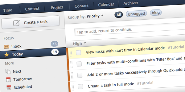
Doit.im has the best GTD implementation I’ve seen. It’s designed specifically for GTD and I think it aligns itself with GTD perfectly. For example when tasks are created, they’re in the inbox (which is not a special folder but more a classification or focus). When you process the inbox the task, it can then can be reclassified as Today, Next, Scheduled, Someday and Waiting. On top of this, independently you can then add to projects and contexts (plus tags for good measure).
Unfortunately Doit.im’s Mac app, is unusable. It’s a cut down version of Doit.im (Web\Android) and feel abandoned. Simple things like putting something into ‘Next Action’ means it will never be seen again in the app and there’s no projects for you to browse either. Sadly that just leaves the Web app for managing tasks on the Mac. It’s good and matches the Android app but I did experience slowness at times and it’s not so good off-line or with a slow Internet connection.
They also just announced premium pricing of 20USD, which I think it’s great. It provides some re-assurance that they have a way to make money and stick around. Something I was concerned about previously, having been around a long time without making money and not publicly announcing how they would.
This is for you, if you’re after a complete GTD style trusted system in one - for Android, iOS and Web.
Astrid & Producteev - The Winners!
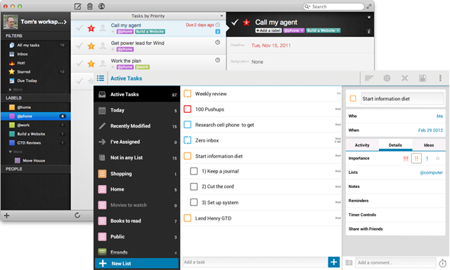
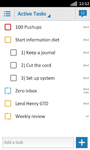
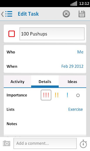
It was a close call but I think these pair just edge it. There’s a great desktop app for the Mac (Producteev) and the best task app I’ve seen for Android (Astrid). They’ve got a host of features and even missing the odd one but I think the User Experience won it over for me. Both make me smile and that’s important. It compels me too look at them, collect on them, organise on them, review on them.
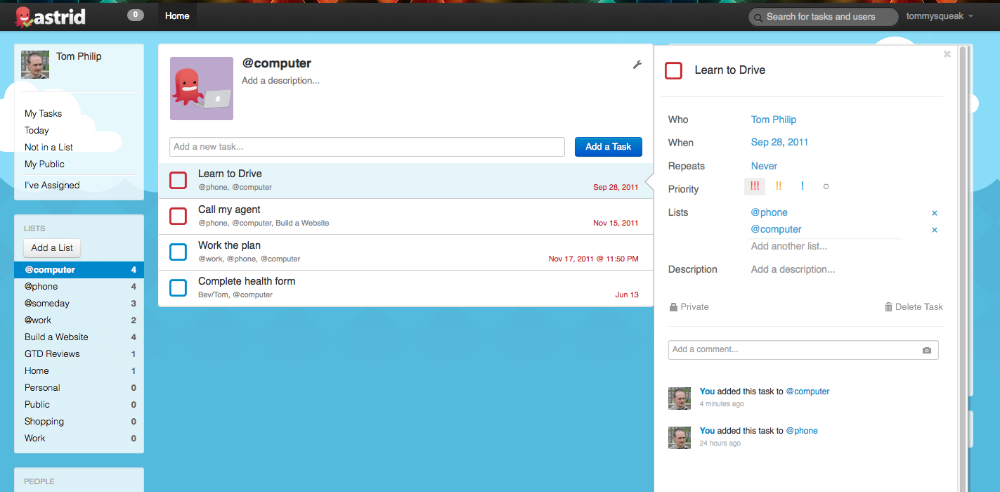
I’ve had Astrid on my phone for a while (as an inbox to collect stuff on the go) and it’s fun to use. I’ve seen it get better and better with each update, which occur frequently. It’s feels good knowing that it’s fantastic now and it’s being actively being developed, getting better all the time. I love its humour too, with it’s reminders, some of them persistent, “snooze time is up! Complete …”, “Feel good about yourself! Let’s go!”, “No more postponing! Complete …“. I even love their Web app, I really wanted a desktop client for speed and offline access but this is really nice. It’s got a simple bright clean interface, it’s like Producteev but on the Web. If they made a Mac one (hint hint) then I’d be in heaven.
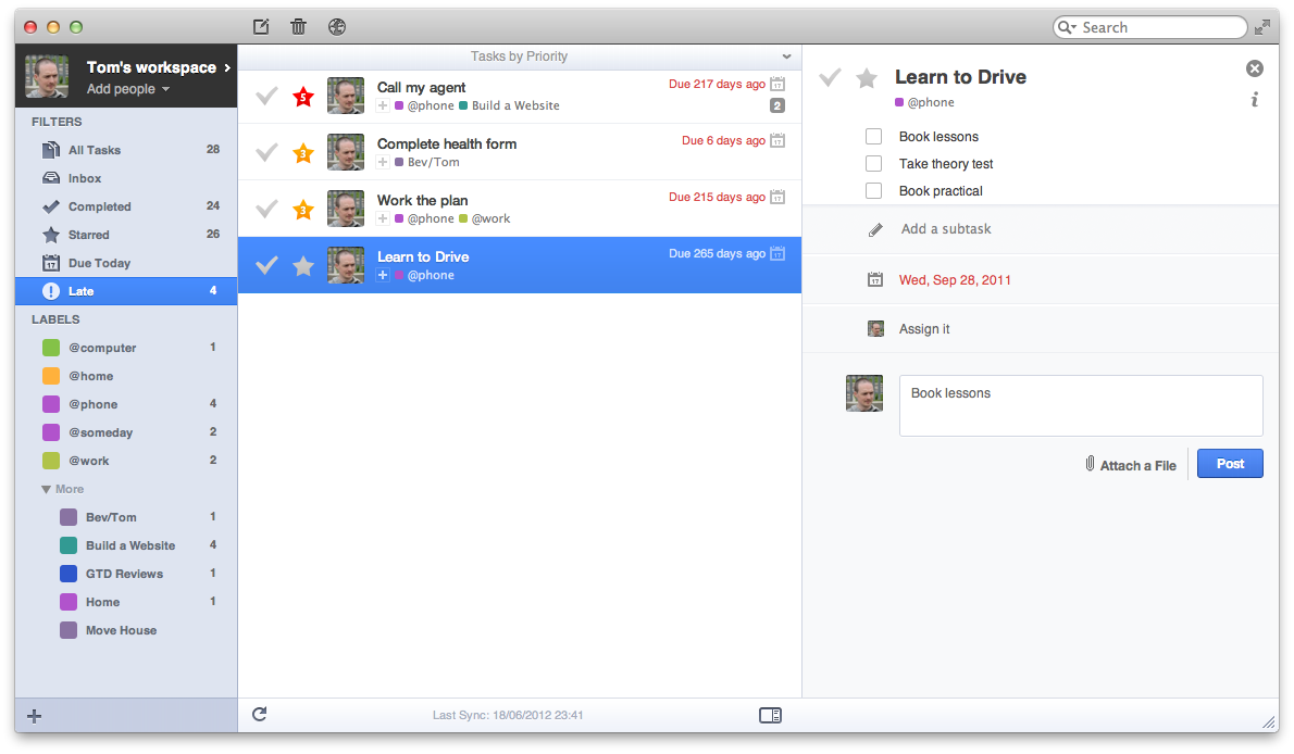
Producteevs Mac app is brilliant. It looks beautiful. It’s both easy to add tasks and manage them . Their Android app is just OK, it’s new and has a long way to go to catch up with Astrid but they’ve shown that they can create great apps with their Mac one. If that gets the love the Mac one does, it’s another option.
Since the reviews for these 2, there’s been some updates too.
Producteev
- A UI make over (I thought it was great as it was)
- Sub tasks (although they don’t sync with Astrids)
- An Android app
Astrid
- Sub tasks (although they don’t sync with Producteevs or Astrid.com)
- A lovely new UI, that fits in with Android 4.0 (Ice Cream Sandwich)
- More customisations
- A web clipper
- Some ordering on the Android app but don’t sync to Producteev or Astrid.com
- Lots of little things which I keep noticing after updates that has me thinking “that’s cool”. For example; prompts me on missed calls to add a task to call them back or do something else.
This is how they look now
It’s not all roses, there’s some workarounds/concerns:
- Lack of contexts/tags mean using lists for projects and contexts (tasks can belong to more than one list). Not ideal but do-able. So lists like @home, @phone for contexts would keep them at the top and the ’@’ signify it’s a context, not a project list. Producteev only showing the first 5 lists is a pain.
- A few people complaining that syncing with Producteev sometimes doesn’t work. I didn’t test it long enough to really know, so this a concern.
So there your have it. Producteev and Astrid take the winners medal. I’m going to start using these 2 in anger which will be the real proof. If it all goes horribly wrong I’ll report back!
Hope you enjoyed the series, I certainly didn’t ;) I never foresaw the amount of time and effort it would take. Next time I’ll just look at some apps and pick one. Agree? Which is your fave?
Over and finally out.
The perfect GTD system does not exist.
Question mark photo credit - Scott McLeod

